Blog Details
UI/UX Design Optimizations: Make the Chatbot Noticeable and Inviting
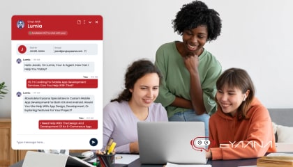
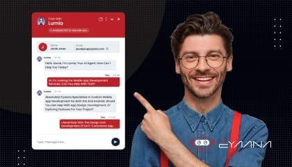
In today’s digital world, chatbots have become essential tools for customer support, sales, and engagement. However, simply adding a chatbot to your website isn’t enough—users need to notice it and feel encouraged to interact with it. This is where UI/UX design plays a crucial role.
A well-designed chatbot should seamlessly blend with your website’s aesthetics while standing out just enough to catch the user’s eye. It should feel inviting, accessible, and intuitive to use. Optimizing UI/UX elements such as button placement, color schemes, animations, and conversational design can significantly impact user engagement.
In this article, we’ll explore the best UI/UX design strategies to make your chatbot more noticeable and appealing. From choosing the right visual elements to ensuring smooth user interactions, these optimizations will help maximize the effectiveness of your chatbot and enhance the overall user experience.
UI/UX Design Strategies to Make Your Chatbot More Noticeable
-
Prominent Placement and Contrast: Position your chatbot launcher where users expect it – the bottom-right corner – and make it visually distinct. Users tend to ignore chat buttons that deviate from the standard location or blend in with the page. Using a contrasting color or icon that stands out ensures the chatbot won’t be overlooked.
-
Persistent Visibility: Keep the chat icon always visible as users navigate. A fixed, floating button “above the fold” (staying on-screen as they scroll) guarantees the chatbot entry point is always one click away when help is needed. This constant presence reminds users they can get assistance at any moment.
-
Eye-Catching but On-Brand: Design the widget to be inviting and on-brand. Choose colors for the chat bubble or button that align with your site’s theme yet still pop out from surrounding elements. Many sites also add a friendly chat avatar or speech-bubble icon to draw the eye and clearly signal “here’s a chat for help.” The goal is to make the chatbot entry instantly recognizable without clashing with your UI.
-
Clutter-Free Surroundings: Give the chatbot icon some breathing room. Avoid crowding it with too many other badges or buttons nearby. A clean layout around the chat entry helps funnel the user’s attention toward it. In fact, if your page is very busy or poorly organized, visitors might not even spot the chat box and could leave out of frustration. Ensure your page layout makes the help option obvious.
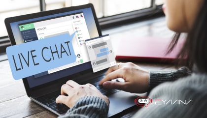
Messaging Techniques to Encourage Engagement
![messaging-techniques-to-encourage-engagement-min[1].jpg](/media/bhppgcja/messaging-techniques-to-encourage-engagement-min-1.jpg)
-
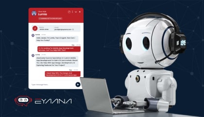
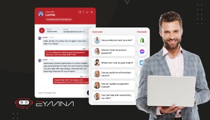
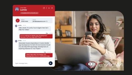
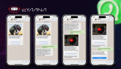
Friendly, Human-Like Tone: Craft the chatbot’s welcome message in a warm, conversational tone. This immediately puts users at ease and makes the bot feel approachable. For example, instead of a stiff greeting, use a personable voice (“Hi there! I’m here to help.”). A conversational style makes the experience feel less robotic – people love a friendly chat more than a cold automated reply.
-
Helpful Greeting Question: Open with a simple question or prompt that invites interaction. A classic line used across industries is “Hello! How can I help you today?” – a straightforward, no-pressure opener that encourages users to type a response. By immediately asking how you can assist, the chatbot signals it’s ready to solve problems, nudging the user to engage in the conversation.
-
Be Informative, Not Pushy: In the greeting, briefly introduce the chatbot’s role or capabilities, but don’t overwhelm or hard-sell. For instance, “Hi, I’m Max, the virtual assistant. I can answer questions about our products or help you book a demo.” This lets the user know what the bot can do for them. Keep it light and helpful in tone – not too “salesy” or aggressive. An informative yet gentle greeting builds trust, whereas a pushy message can deter interaction.
-
Offer Quick-Start Options: To lower the effort on the user’s side, provide suggested replies or clickable FAQs in the intro. For example, display buttons like “🛈 Shipping info” or “Talk to support” that users can simply tap instead of typing out a question. Offering a set of common queries or topics gives the user an easy starting pooint. This interactive onboarding guides users into the conversation and encourages them to make that first click.
-
Contextual and Personalized Messaging: If possible, tailor the chatbot’s greeting to the page or user context. A user on a pricing page might see “Questions about pricing? I’m happy to help!”, whereas on a support page the bot could greet with “Need help troubleshooting? Ask me anything.” Adjusting the welcome message to fit the user’s likely needs makes the chatbot feel more relevant and engaging. The personalization shows that the bot is aware of their context, piquing the user’s interest to interact.
Call-to-Action Strategies to Drive Interaction
-
Clear “Chat Now” Cues: Treat your chatbot launcher as a call-to-action button. Use clear labels or icons that unmistakably indicate it’s a live chat. For instance, a button labeled “Chat Now” or a chat icon with the text “Help” makes the function obvious. Avoid vague phrasing like “Contact” or “Questions?” which might be misconstrued as a link to a FAQ page or email. A direct label sets the expectation that clicking it will start an immediate conversation.
-
Proactive Chat Invitations: Don’t always wait for the user to click – have the chatbot initiate the conversation at opportune moments. For example, after a visitor spends 30+ seconds on a page or scrolls halfway down, trigger a gentle pop-up message: “Need any help? I’m here if you have questions.” This proactive outreach acts as a strong CTA to engage. In fact, users invited to chat are far more likely to interact – one source notes they can be 6× more likely to become customers after a chat. Timing is key: send the invite after the user has had a moment on the site, so it feels helpful rather than intrusive.
-
Compelling Welcome Offers: Give users a reason to start the chat by highlighting a benefit or exclusive offer. For example, the chatbot’s greeting might mention, “Ask me about our special discount available today!” or “I can provide instant answers – no waiting on hold.” This call-to-action messaging creates curiosity and incentive. Using the chat to share timely deals or tips (e.g. a coupon code, free trial info) can motivate visitors to click the chat button. The key is to frame the chat as valuable to the user (saving time, saving money, etc.).
-
Clickable Buttons Inside the Chat: Within the conversation, use CTA buttons and quick replies to drive the next steps. Instead of making the user type “yes” or navigate your site manually, provide one-click options like “Check Order Status” or “View Cart”. For instance, if the bot asks “Do you want to see more examples?”, present a button “Show me more.” These in-chat call-to-action buttons make it easy for users to continue and deepen the interaction. In one example, a chatbot automatically presented a “Get in touch” button after a few seconds of user inactivity to re-engage the. Strategically placed buttons keep the momentum and guide users toward meaningful actions (like signing up or contacting sales) via the chat.
Placement and Visibility Improvements
-
Standard Location Across Site: Deploy the chatbot in a consistent spot on every relevant page, typically the lower-right corner. This consistency taps into user familiarity – after years of seeing chat widgets, people instinctively look to the bottom-right front. Sticking to this convention means users won’t have to hunt for support; they’ll notice the chat icon where they expect it. It also avoids covering content, since bottom corners are usually free of critical information.
-
Always On, Never Obstructive: Ensure the chatbot’s presence is constant but not in the way. Keep the icon visible immediately when the page loads (no need to scroll to find it) and use a floating/fixed position so it stays on-screen. At the same time, design it to be small enough not to block important content. On desktop, a compact chat bubble in the corner is standard. On mobile, use a collapsible button or an icon that can be easily minimized. For example, some mobile sites show a tiny chat bubble that the user can tap, and it might even auto-hide as the user scrolls so as not to overlay product. The chatbot should be highly accessible without ever frustrating the user’s browsing.
-
Presence on High-Need Pages: Increase visibility on pages where users are most likely to seek help or make decisions. Common practice is to prominently feature the chat on pages like Contact Us, FAQ/Help Center, Pricing, and Checkout. If a user is on a pricing page, they might have last-minute questions – a visible chat entry can capture them before they drop off. Similarly, on support or contact pages, a chat offers immediate resolution. By placing the chatbot where friction or questions typically arise, you provide a convenient lifeline exactly at the moment.
-
Mobile Optimization: Don’t neglect placement on smaller screens. On mobile devices, space is limited, so use a simple chat icon or a slide-up drawer. Ensure it doesn’t cover essential UI elements (like navigation or “Add to Cart” buttons). Many companies keep the chat icon at bottom-right on mobile as well, but make it smaller and hide the welcome text to save space. Also, allow easy dismissal – for example, a quick swipe might hide the chat window. The best implementations keep the chat entry visible but unobtrusive on phone. A well-placed mobile chat means users can get help on the go without a clunky experience.
Psychological Triggers to Spark Curiosity and Interest
-
Proactive Greetings (Making the First Move): A chatbot that greets users proactively can trigger reciprocity – when the bot says “hello,” users naturally feel inclined to respond. A timely, friendly pop-up (“Hi! Let me know if you have any questions.”) can pique curiosity, especially for users who might be hesitant. Being proactive greatly increases engagement chances; visitors invited to chat by the bot often end up interacting when they wouldn’t have other option. The key is a gentle nudge – a personable greeting or helpful offer – that entices the user to see what the bot has to say.
-
Notification Badges and Visual Cues: Leverage subtle animations or badges on the chat icon to arouse curiosity. For instance, a “new message” dot or a small unread indicator on the chat button can catch the user’s eye and make them wonder what’s waiting. This works similarly to social media notifications – a tiny red dot that’s not intrusive but hard to notice. Small visual cues like a blinking chat icon, a wobble animation, or a highlighted badge create a sense that there’s something interesting or helpful to be discovered, prompting users to open the chat.
-
Humanize the Bot Experience: People are naturally more curious and trusting towards human-like interactions. Giving your chatbot a name, avatar, or persona can intrigue users and encourage engagement. For example, an AI assistant named “Alex” with a friendly avatar (even a simple cartoon face or company mascot) feels more like a real helper. Many companies find that adding a human touch – a bit of personality or humor in the chatbot’s profile. Users become more willing to “chat” when it feels like a conversation with a friendly assistant rather than a faceless bot. A lighthearted or empathetic tone can also tap into emotions, making the interaction more engaging.
-
Social Proof and Trust Signals: Another psychological lever is showing that the chatbot is there and ready to help (and that others use it too). Messages like “Support Agent online now” or displaying the agent’s name and picture can reassure users that help is immediate. Some chat interfaces even show statements such as “Typically responds in under a minute,” which plays on the user’s desire for quick support. This assurance can push a hesitant user to engage, knowing that they won’t be wasting time. Additionally, if your industry allows, mentioning stats like “Helping 100+ users right now!” or showing a satisfaction rating can spark interest – it signals that the chat is a popular, trusted resource. Curiosity and FOMO (fear of missing out on a quick solution) can prompt users to click the chat when they see others have benefited.
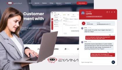
Reducing Friction and Hesitation Factors
![reducing-friction-and-hesitation-factors-min[1].jpg](/media/nc1pl440/reducing-friction-and-hesitation-factors-min-1.jpg)
-
Instant Gratification (Speed is Key): One of the top reasons users hesitate to use support channels is fear of wasting time. Highlight and deliver on the chatbot’s ability to provide immediate answers. When users know they can get help in seconds (rather than waiting for an email or call), they’re far more likely engage. Emphasize that the chatbot is available 24/7 and responds right away – for example, your UI can display “Bot is online – typically replies immediately.” Fast response not only satisfies users’ need for quick info, it also prevents frustration that would cause them to abandon the cart. In short, speed and availability reduce the “effort cost” of asking a question.
-
Remove Barriers to Entry: Make it as easy as possible to start the chat. Avoid lengthy pre-chat forms or requiring users to log in just to ask something. Every extra step (entering an email, choosing a topic from a long menu, etc.) is friction that can scare users away. Industry best practice is to let the user jump straight into chatting and only ask for info when absolutely necessary. For instance, instead of mandating an email upfront, allow the conversation to begin and request an email later only if needed to follow up. Companies that experimented with mandatory pre-chat forms saw users drop off or avoid the chat entirely due to lengthy pre-chat forms. Keep the chat launch as one-click simple – open window, user types their question.
-
Low-Pressure Interaction: Alleviate any fear that the chatbot will be pushy or trap the user. Design the experience so that users can easily exit or mute the chat if they want. Having a clearly visible close button or a minimize option gives users an escape hatch, which paradoxically makes them more comfortable engaging. Also, don’t bombard the user with messages if they don’t respond immediately. One follow-up like “I’m here if you need anything” is fine, but repeated prompts can feel like spam. When users feel the chat is on their terms, not the bot’s, they’re less hesitant to use it.
-
Clarity and Transparency: Be upfront about what the chatbot can and cannot do. Users may hesitate if they’re unsure whether they’re chatting with a real human or a bot, or if the bot seems to over-promise. It’s a best practice to introduce the bot as, for example, “your virtual assistant” and set expectations like “I can answer questions about services or connect you to a human agent.” Being transparent that it’s an AI chatbot (and giving an option to reach a human if needed) can actually increase user trust and willingness. Users appreciate knowing what kind of interaction they’re in – it removes the hesitation that comes from uncertainty. Additionally, reassure them about privacy if appropriate (e.g. “Your info is safe with us”), as that can be a silent worry for some users.
-
Smooth, Bug-Free Experience: Finally, reduce any technical friction. Ensure the chat widget loads quickly and works on all devices/browsers – a laggy or broken chat is a major turn-off. Also, implement features like typing indicators (“Chatbot is typing…”) or progress spinners so the user knows it’s working on a response. Little UX touches like that go a long way: when users see a typing indicator, they’re less likely to get anxious or abandon the chat. All these tweaks minimize user frustration. The easier and more seamless the chat feels, the less hesitation users will have about using it again and again.
Industry-Wide Best Practices for Chatbot Pop-Ups and Interactions
-
Use Familiar Greeting and Flow: Nearly every successful chatbot follows a similar playbook for the greeting – a friendly hello and an offer to help. This convention has become an industry standard because it works. Users are used to seeing a chatbot say “Hello! How can I help you today?”, which immediately signals a customer-service. Sticking to this familiar script (and variations of it) helps users know exactly what to do: they recognize it’s a chat assistant and feel encouraged to reply. Likewise, most bots across industries will start with a simple question or present a few quick-option buttons. Adhering to these well-known patterns means the chatbot’s behavior meets user expectations, reducing confusion and increasing engagement.
-
Maintain Consistent Brand Personality: Companies in every sector give their chatbots a coherent personality and keep the experience consistent with their brand. This is more than just a name and avatar – it’s about the tone of language, the level of formality, and the helpful attitude. A tech startup might have a casual, playful bot, whereas a bank’s bot might be polite and formal, but both will align with their brand image. The important part is to be consistent: from the chat window design to the bot’s phrasing, ensure it feels like part of the same brand the user is already interacting with. A seamless, on-brand chatbot experience across all pages (and even other channels like mobile apps) builds user comfort. When the chatbot “feels” like the company, users are more likely to trust it and use it.
-
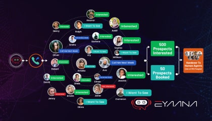
Guide the User with Interactive Elements: An industry best practice is to never present the user with a dead end or a blank slate. Effective chatbots always guide the user on what to do next – either through suggested replies, menus, or follow-up questions. For example, if a user just asked about store hours, the chatbot might next prompt, “Would you like to find the nearest location?” providing buttons for “Yes” or “No”. This kind of guided conversation is now common in chatbot design because it keeps users engaged and makes the interaction effortless. Many support chatbots begin by showing a menu of common topics or FAQs to preempt the user’s question. This reduces user effort and keeps the dialogue flowing. Across industries, bots that proactively steer the conversation (while still allowing free input) tend to achieve higher engagement and user satisfaction.
-
Balance Proactiveness with User Control: It’s widely agreed that while proactive chat pop-ups can boost engagement, they must be done tactfully. The best implementations across different industries use smart triggers (like time on page or exit intent) to offer help, but always give users an easy way to decline. For instance, a chatbot might pop up and say “Need help finding anything?” with options to either start chatting or dismiss the message. If the user closes the chat, the bot stays minimized and doesn’t keep nagging. Respecting the “no thanks” is just as important as offering help. Industry leaders configure their chatbots with careful rules: when to appear, how often to re-ping a silent user (usually no more than once), and how to gracefully exit. This ensures the chatbot is seen as a helpful tool, not an annoyance.
-
Provide Escalation Paths: No matter the industry, a best practice for chatbots is to handle what they can and seamlessly hand off what they can’t. If a question is too complex or the user is getting frustrated, the chatbot should offer an option to connect with a human agent or leave a message for follow-up. For example, “I can also have a human agent help you. Would you like to chat with a person?” – with a button to transfer. Similarly, outside of business hours, bots often collect the user’s query and contact info, essentially creating a support ticket. This safety net is standard because it improves user experience: visitors know that even if the AI isn’t able to solve their issue, they won’t be left hanging. It reduces drop-offs and leaves users with a positive impression of the support process as a whole.
-
Learn and Iterate (Continuous Improvement): While not exactly a front-end “engagement” tactic, it’s industry standard to continuously refine your chatbot based on user interactions. Successful chatbot deployments log the questions asked, where users get stuck, and when they drop off. This data is then used to improve the bot’s responses and decision trees. The takeaway for best practice: regularly update your chatbot’s knowledge base and behavior so it stays useful and engaging over time. Many companies also solicit feedback after a chat (“Was this helpful?”) to identify pain points. By tuning the chatbot with real user data, you ensure it remains relevant across use cases and industries. A well-trained bot that can actually answer users’ questions correctly is inherently more engaging than one that gives poor or generic answers. Thus, following this behind-the-scenes practice results in a chatbot that users open more frequently and find value in engaging with.
Each of these strategies – from an inviting UI to psychological nudges – works together to make your website’s AI chatbot more noticeable, approachable, and satisfying to use. By implementing these best practices, which have proven effective across technology and other industries, you can significantly boost the number of users who not only open the chatbot, but also actively engage with it and come away with a positive attitude.
To explore how AI can enhance your business operations, sign up for free and get started with Eyaana today.
Do you need help?
We will provide detailed information about our services, types of work, and top projects. We will calculate the cost and prepare a commercial proposal.